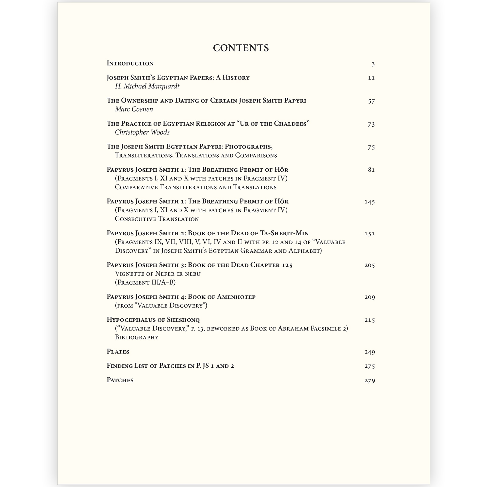
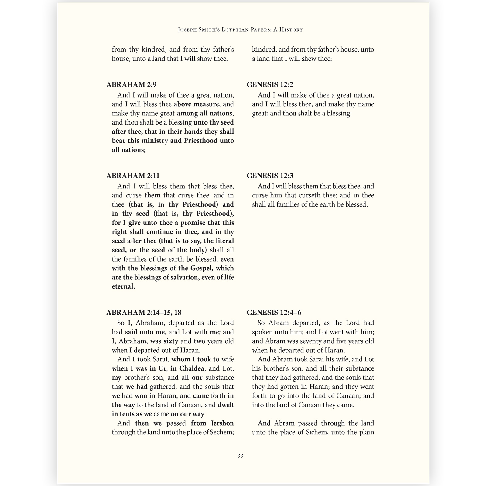
This major Egyptological work is one of the most complicated books I have done. The complex text includes sections using a specialized font (unreadable to non-specialists) for transliteration of Egyptian hieroglyphs, another font for hieroglyphs in the footnotes, images in the midst of paragraphs, sections in verse, text in Greek, and painstaking work to prepare the color plates. I created a system of dozens of paragraph styles and a complex hierarchy of headings to accommodate the many different types of material. The first edition sold out and the book was reissued as a paperback. This second edition was not only smaller, but the page proportions were different as well, meaning the original layout could not just be reduced to fit. I rethought and adjusted all aspects of the design to match the new geometry while remaining as clear and readable as the original, amounting to laying out the entire book again.
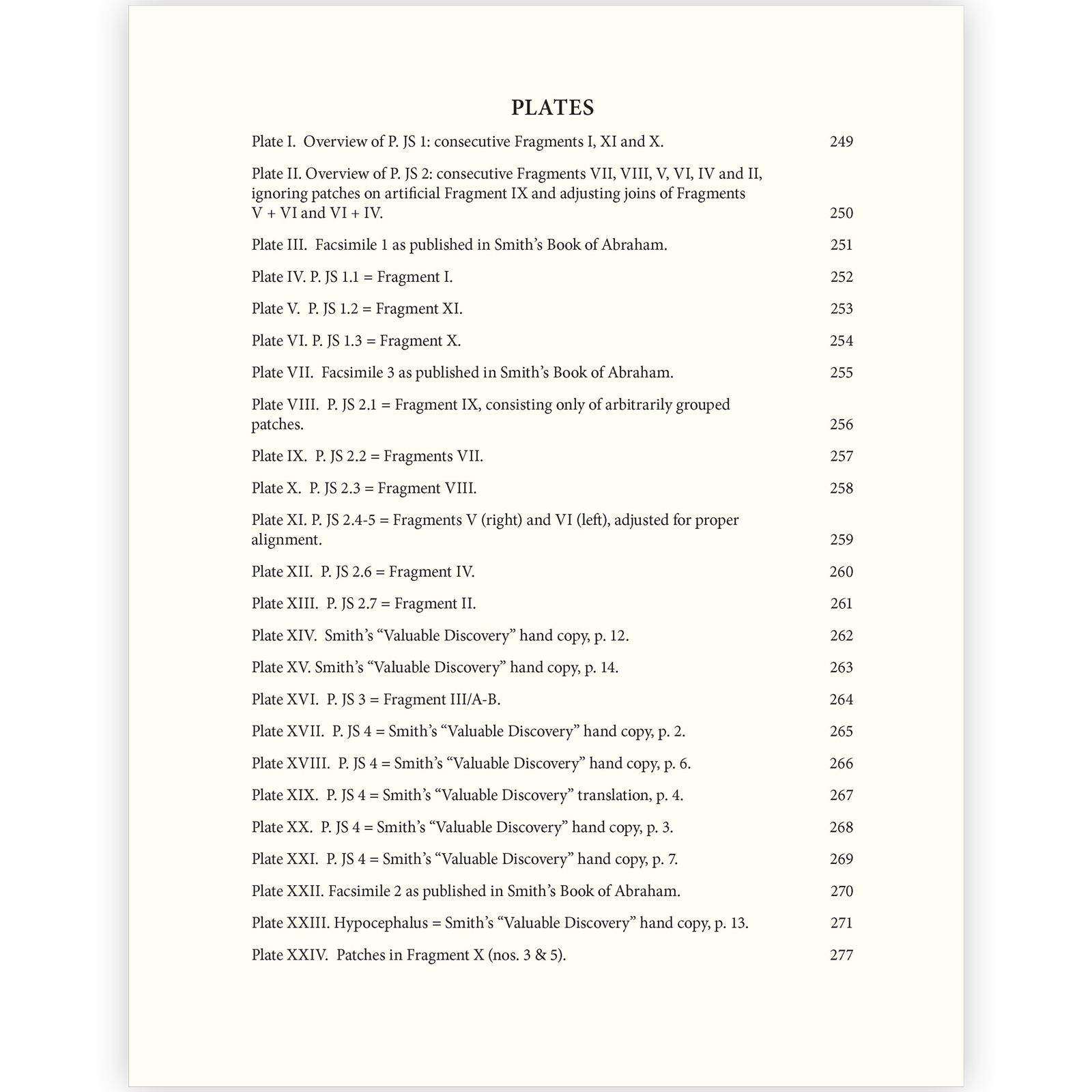
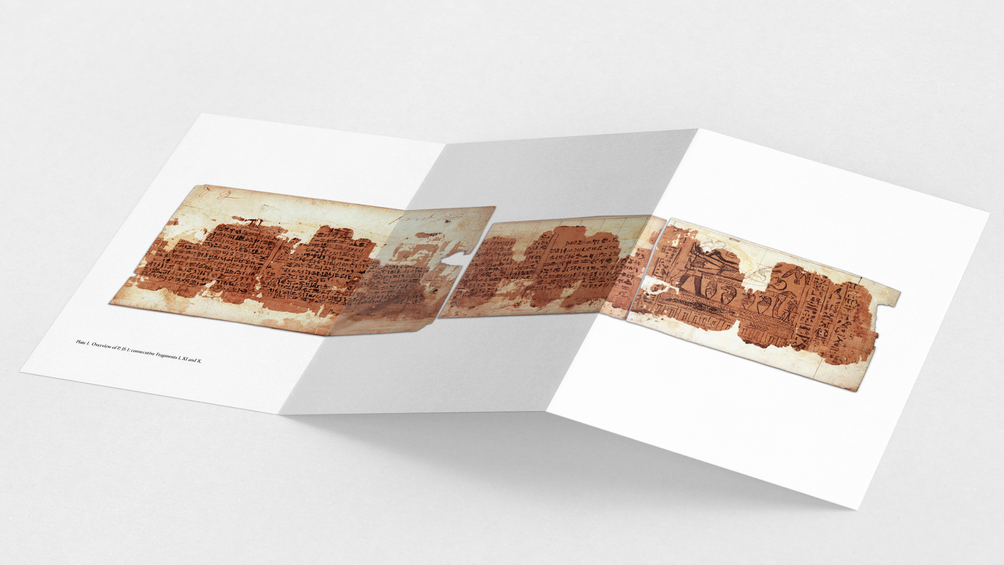
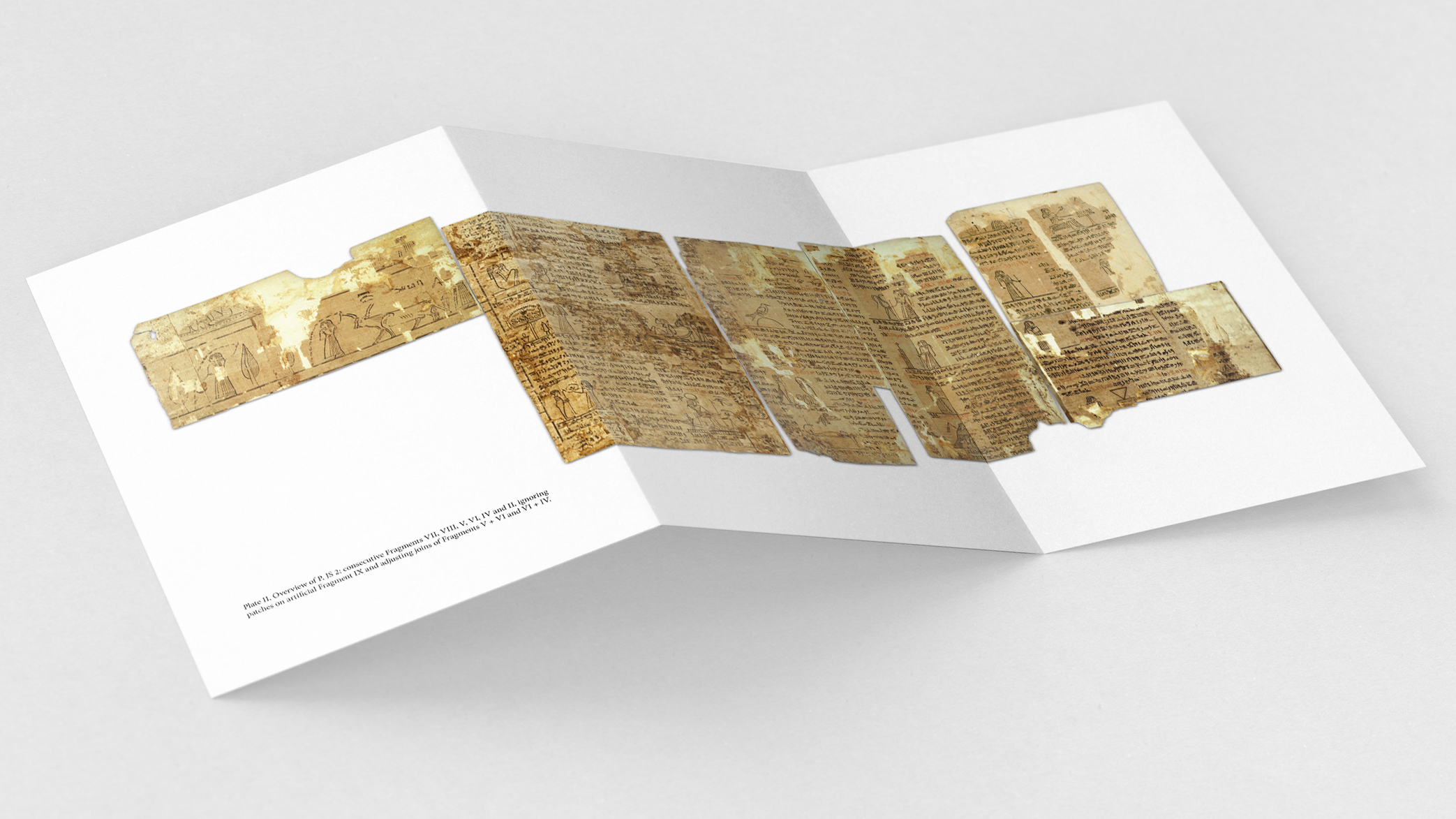
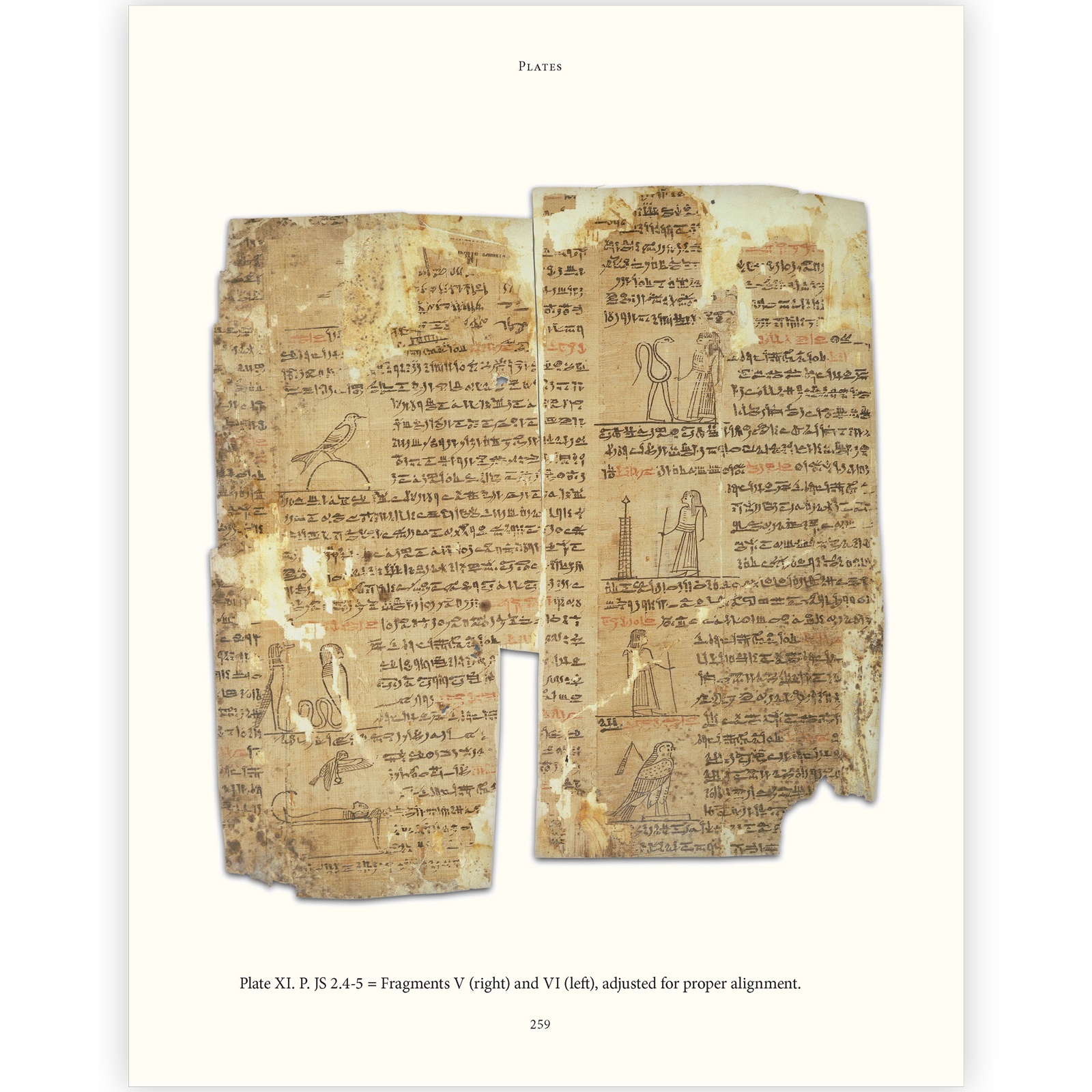
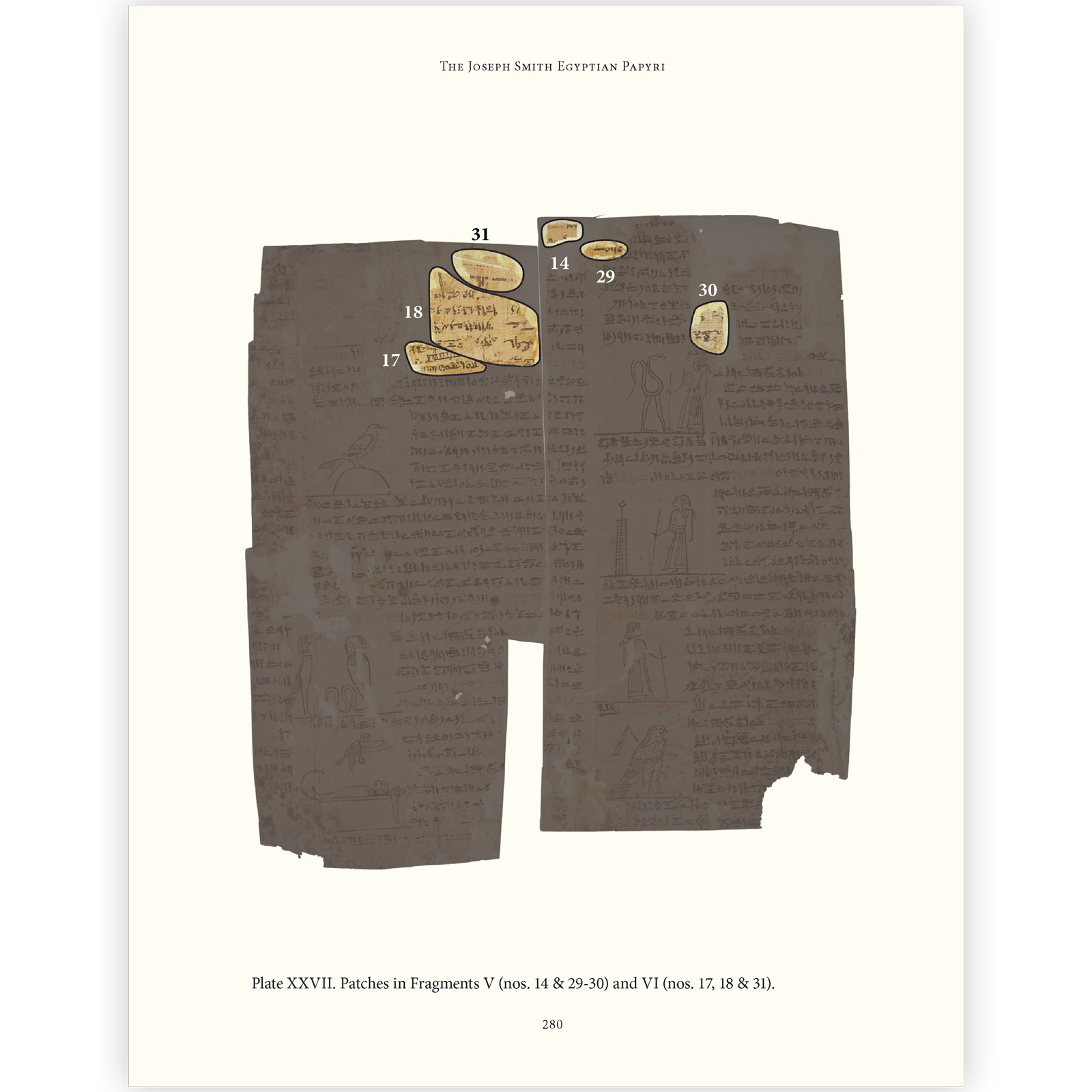
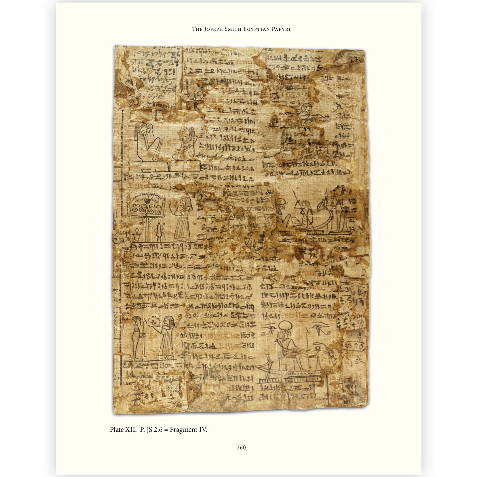
To produce the color plates for the volume, I first (digitally) removed backgrounds (old frames, cardboard, etc.) from the photos, then created two triple width fold-out pages by aligning fragments that had once been a scroll but were later cut apart. In other words, I received photos of the pieces and reassembled them. To show where patches were glued onto the papyrus, I made a second set of plates with all but the patches masked in gray, then numbered the patches to correspond to a list included in the book. In all, the book has roughly 40 plates, only a few of which are not in color. The plates are printed on glossy paper, while the text is not. The project required constant communication with the author, the publisher and—critically—the printer. I oversaw the production and binding processes of the original edition.
(285 pages, 8.5 x 11 inches, hardcover, 2011) & (325 pages, 6 x 9 inches, paperback, 2013)
Click on any image for a larger version.